axe
2023 х 2024
New website of the AX brand, which speaks the same language to the audience
Client
Axe
fmcg-brand website
catalog
landing page
About project
How we launched a website that was fresh in every sense
We have developed a new AX brand website that speaks the same language to the audience - there is a complete product catalog and a lot of bold content in the AX style.
Close partnership work with the client at all stages of project creation made it possible to create a brand website not just based on guides and technical specifications, but also to rethink the catalog, as well as find a bold visual language and communication that resonates with the audience.
What have we done
Site development
UX/UI
Game mechanics
Landing
HOW WE TARGETED IN CA
We relied on the interests and lifestyle of the consumer
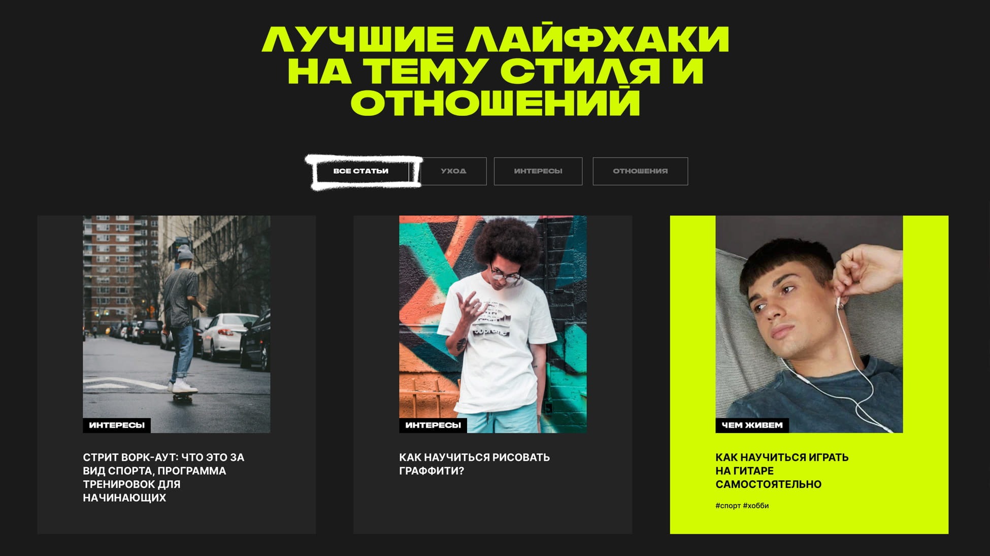
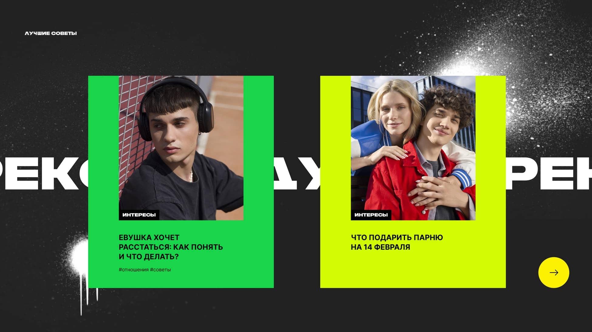
Articles are based on the interests and values of the target audience. They were also the reference point in developing the design and copyright of the updated site.
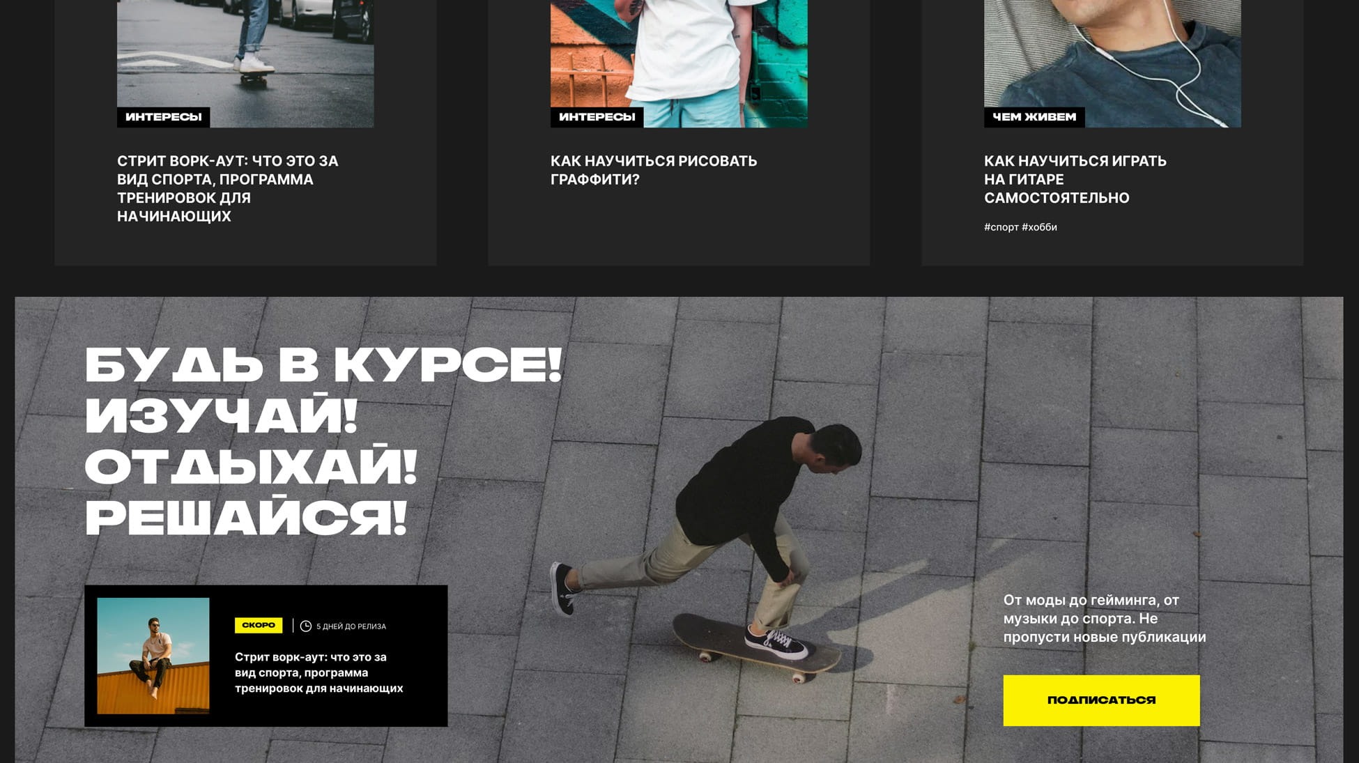
We filled the articles according to the principle of a block constructor where you can add visual elements. Each block can be made unique.
filling
native copyright and relevant humor
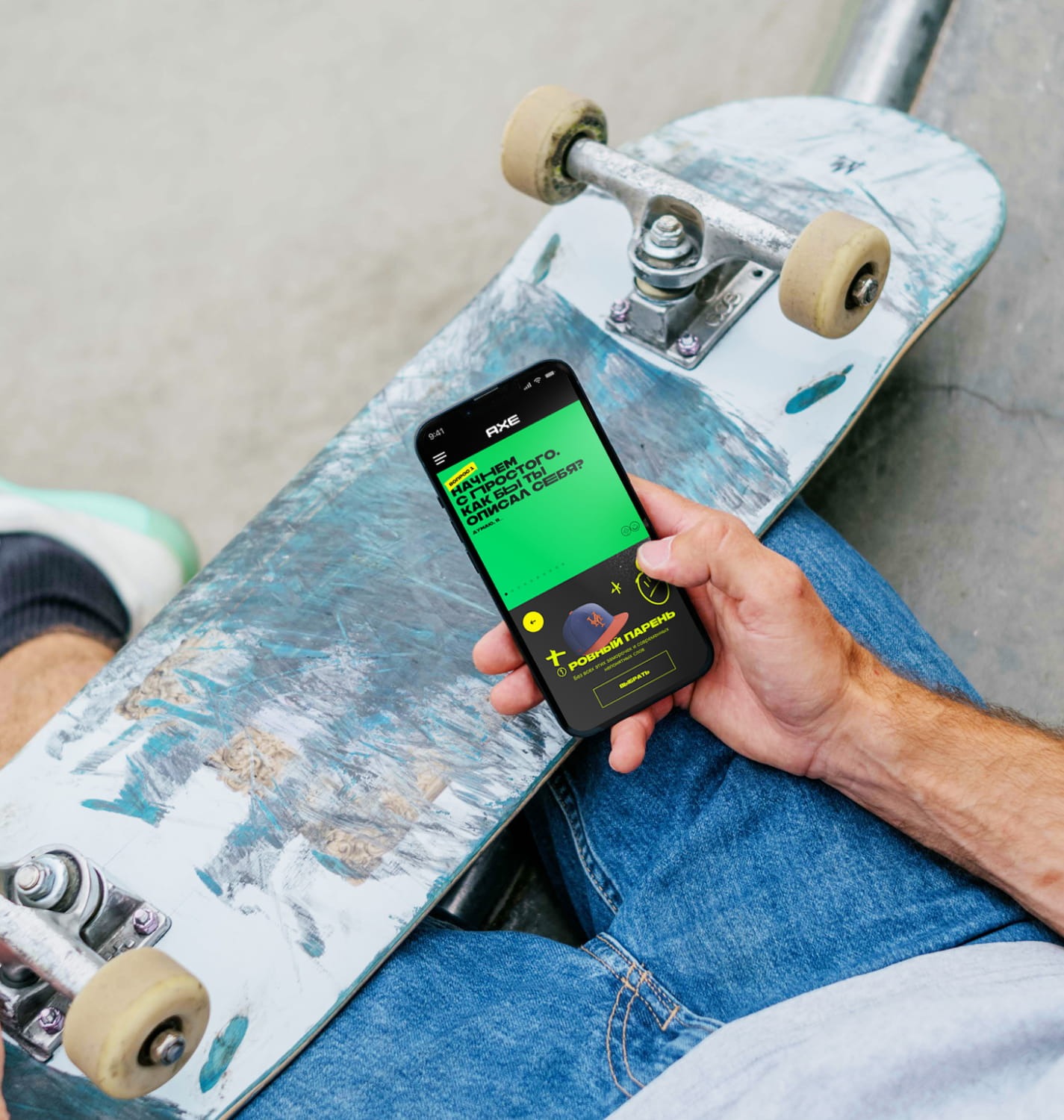
Particularly noteworthy is the interactive test, which is based on communication through memes and situations familiar to the audience. At the end of the quest, the user receives a discount on the product.
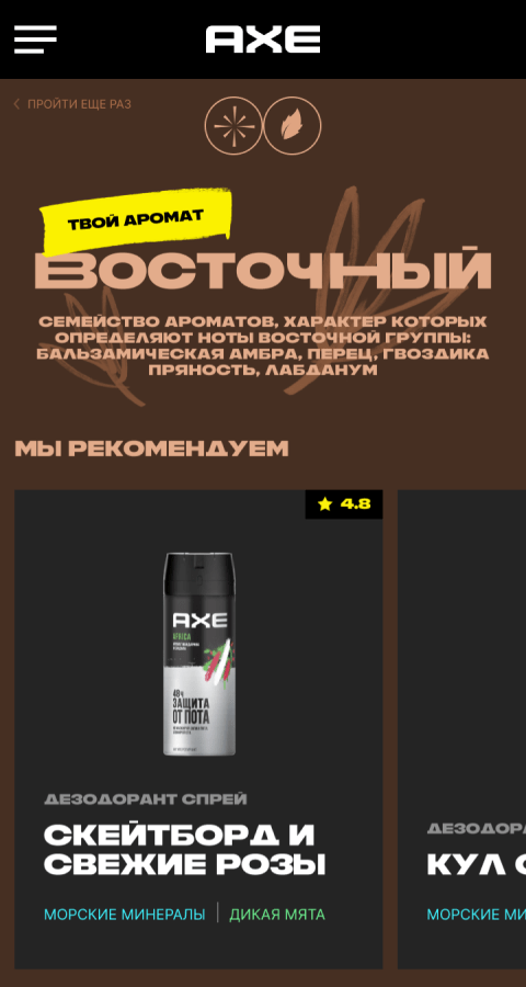
landing page
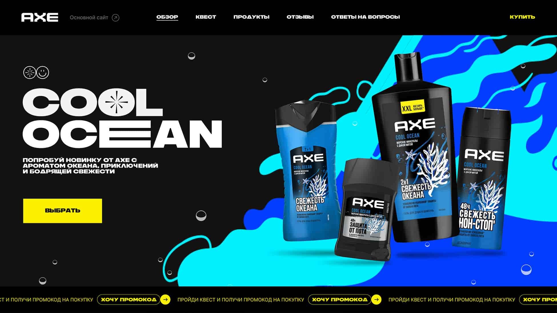
COOL OCEAN PAGE
Functional: everything from design to copywriting reflects the Cool Ocean theme of freshness. Emotionally: the interactivity inside the landing page conveys the idea that even when running through the city streets, you remain fresh if you use a brand product. Intelligible: we openly connect the name of the line with the visual, immersing the audience in the “ocean”.
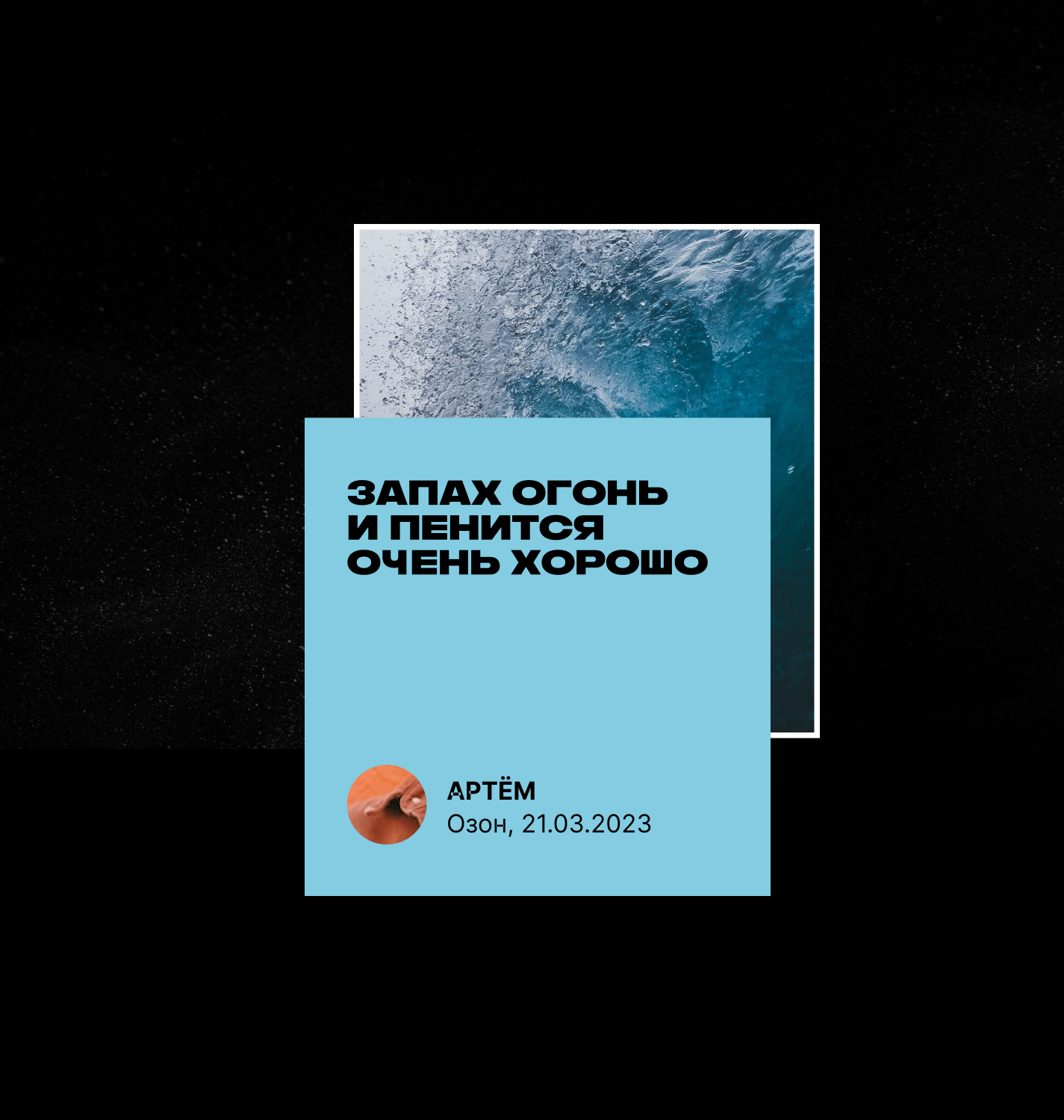
what happened
The brand website was completely updated in 4 months
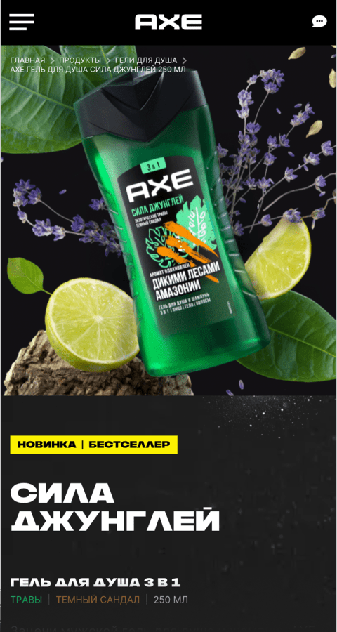
The catalog integrated a design that emphasized the uniqueness of fragrances, introduced the ability to immediately proceed to purchase on marketplaces, and integrated a service for collecting reviews. We also developed an administration panel to manage content without involving developers, saving the client money and time.
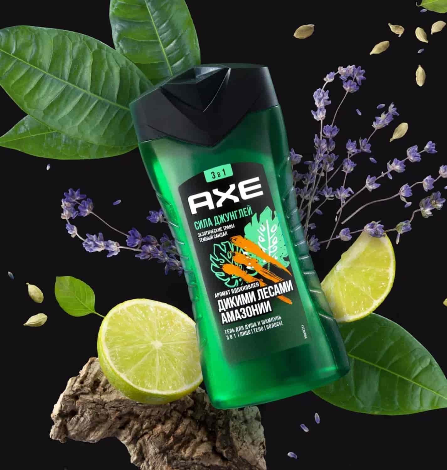
indicators
Result
Thanks to the new design and interactive mechanics, the site has become more interesting to the target audience, as evidenced by the indicators: the average time of interaction with the site and the depth of page viewing have increased.
The site's viewing depth increased to 1.98, and the same indicator for the Cool Ocean quest page reached 3.3 in the first 3 months.
Axe
2023 х 2024
Axe
2023 х 2024
Axe
2023 х 2024
Axe
2023 х 2024
Axe
2023 х 2024
Axe
2023 х 2024
Axe
2023 х 2024
Axe
2023 х 2024
Axe
2023 х 2024
awards
The best FMCG brand website. Tagline Awards 2023
gold
indicators
Total audience reach
12.5 million
team 8
Tatiana Khodas
Team Lead
Ekaterina Romanova
CPO
Vadim Tyurin
Design Director
Anastasia Khristoforova
Art Director
Anna Kiryanova
Designer
Alena Lebedeva
Art Director
Natalia Pilyugina
Designer
Andrey Suchkov
Дизайнер

Brand Ambassadors Academy
DIGITAL SERVICES AND SITES
2023
